Intro
As a web developer, meeting the compliance set by Americans with Disability Act (ADA) is not likely to be on top of anyone’s list. (I confess, it hasn’t been for me as well).
Recently I was given a task of making one of our ongoing project ADA compliant. While the task itself isn’t fancy nor fulfilling in terms of stimulating challenges, it isn’t something we should take lightly. With our dependence on the world-wide-web ever increasing, it became virtually impossible to have a role as a contributing member of today’s world. Just as commercial buildings provide ramps and large restroom stalls for wheelchairs, we should do our best to provide web applications for users with vision, hearing, motor and other impairments that use screen-readers.
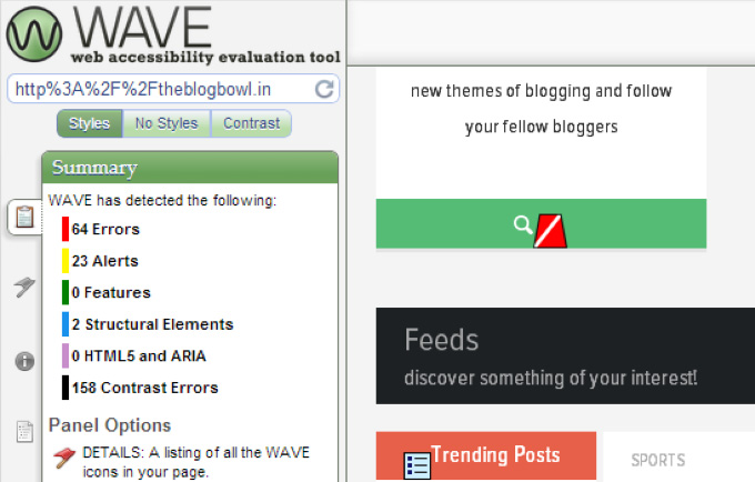
For this task we have used the Wave Evaluation Tool to run the diagnosis test. After installing and running the WAVE add on for your favorite browser, I was met with a list of alerts and warnings that were deemed non-compliant to ADA as seen below:

Disclaimer: With ever increasing complexity of the web application, it’s near impossible to tackle every alerts or warnings that are detected in the web application. For example VideoJS, a topic of two of our previous blog posts that we gush about, is a source of multiple alerts/warnings. Because we have no control over 3rd party libraries’ ADA compliance, those remain un-tackled.
Purpose of this blog post is some of the extra steps to take to ensure that your app is compliant to ADA. They may be trivial but that’s more the reason to make your app disabled friendly.
Context is important
When providing a non-textual elements into you web application, it is important to provide accurate content to those elements.
Here are few examples:
<img>elements must have analtattributes with accurate description in them. Brevity is highly recommended. It’s very obvious but it is very easy to overlook its significance.
example: <img src="spider-man.png" alt="spider-man">
- Checkboxes and radio-buttons should have
<label>associated with them to give those inputs contextual meaning
example:
<input id="agreement" type="checkbox" />
<label for="agreement">I agree to the terms of agreement above</label>
<button>and<a>must enclose text if possible.
WAVE tool does not like it when the <button> and <a> elements enclose anything other than text. That means it’ll alert when the external link has <img> and <svg> in it because it cannot gain any information from those elements. Thankfully, attribute called aria-label appeases the WAVE tool.
<a href="https://en.wikipedia.org/wiki/Spider-Man" aria-label="spider-man wiki">

<img src="spider-man.png" alt="spider-man" />

</a>
You have likely ran into ARIA (Accessible Rich Internet Applications) when looking at bootstrap component codes. It is best to familiarize them when improving the web accessibility.
https://developer.mozilla.org/en-US/docs/Web/Accessibility/ARIA
Use the Header tags properly
Has anyone used something for a long time only to find out that you were using it incorrectly? This is my relationship with the header tags. In my earliest practice of using HTML tags, I would cherry pick the header tags based on its size to match the design documents. Often times than not, the header tag hierarchy would get out of order which would lead to WAVE tool to complain.
I learned that the proper way to use the header tags is to implement h1 tag as the marquee and use the subsequent header tags for the subsection header regardless of its natural size. Because WAVE complains about skipping a hierarchy, make sure to match the following example.
<h1>Marquee title</h1>
<h2>Subsection header title</h2>
<h3>Sub-Subsection header title</h3>
<h2>Repeated Subsection header </h2>
<h3>Repeated Sub-Subsection header </h3>
It’s important to understand that header tags aren’t created for the designers in mind but for the structure of the web-content. The sizes of the headers will have to be changed via CSS to follow the designs.
Hosting PDFs
According to the WAVE tool, link that directs to the PDF files can be a source of issue in terms of navigation because they are seen as separate application.
The following example will upset the WAVE tool:
<a href="https://www.yourwebsite.com/resume.pdf">Resume</a>
The above example will direct you out of the webpage and load a pdf plug in which will cause confusion for the screen-readers.
The workaround I found to be the best is to host the PDF file natively inside your web-application using iframe.
<iframe title="resume" class="resume-iframe" aria-label="resume pdf" src="https://www.yourwebsite.com/resume.pdf" width="1060" height="1001"></iframe>
Aria-label is added in the example to notify the screen-readers of the pdf.
Conclusion
The purpose of this blog post is to provide brief examples of the things I came across when meeting the ADA compliance. Needless to say, types of compliance will depend on the nature of the app, all of them with varying difficulty. Fortunately for my web application, the compliance I had to meet were trivial at best.
Despite high difficulties in some of the compliance, I see a lot of effort made from different parts of internet all for name of accessibility. My favorite example is that two of my favorite educational websites, Egghead and Udemy both provide transcripts to their video content.
Although this compliance task was very trivial compared to my usual task, it is my hope that I helped my web app become more accessible to the often forgotten audiences.
For those blessed with gift of sight, thank you for reading!
